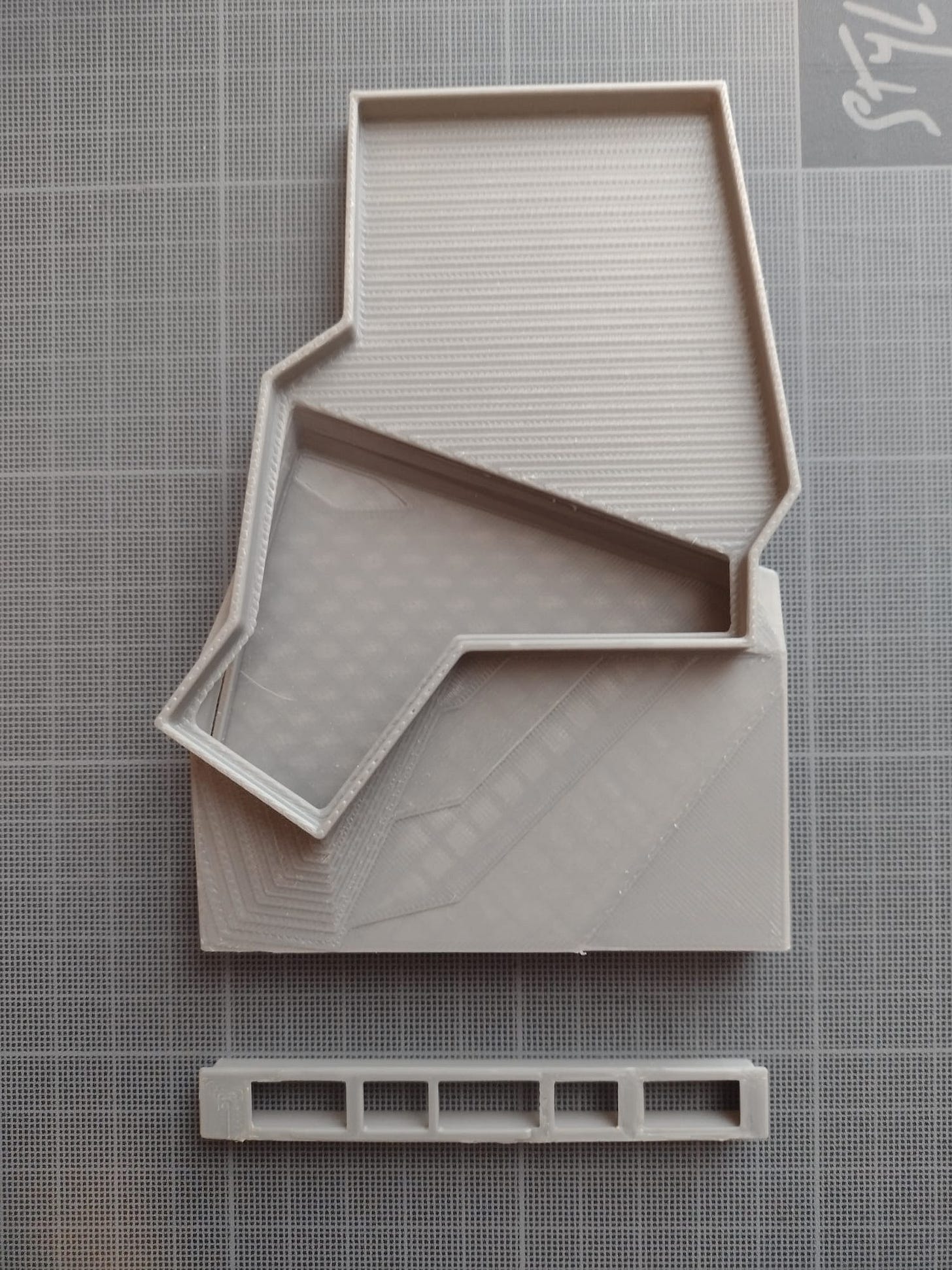
LXR Devlog #4 - Building the Shark!
Let's do it thinner.
Greetings, INNOvators!
The journey towards reimagining computing continues with a new design iteration. This time, we assist to the birth of the "Shark".
Whereas the Mammoth has been an exciting step into this journey because it gave us a concrete view on what LXR could be, it basically has been designed to “just work”.
Its shapes were pretty chunky and not really easy to fit in a pocket…. But still, it has fulfilled its mission.
This week, with the Shark, we explore a design that is thinner, more ergonomic, with optimized space for components.
The Shark: An Overview
The Shark is still a two-part case designed to house the essential components of the LXR project. The Mammoth confirmed that this was the form factor we wanted.
Let's break down its key features:
Components
Split Ergonomic Keyboard (on top of each part of the case)
Single Board Computer (inside the left part of the case)
Battery (inside the right part of the case)
Design Considerations
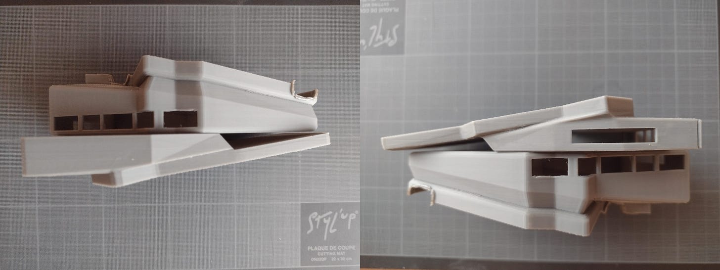
Modularity: The Mammoth has been designed for the Khadas Edge 2 SBC, meaning that the slots were adapted to its connectors (USB-C, HDMI, Charge….). This time, we designed large slots on both sides to test several components and open the door for SBC/Battery customization (screens below).
Ergonomics: Make it thinner. The idea with this iteration is to design a case that is more comfortable to use.
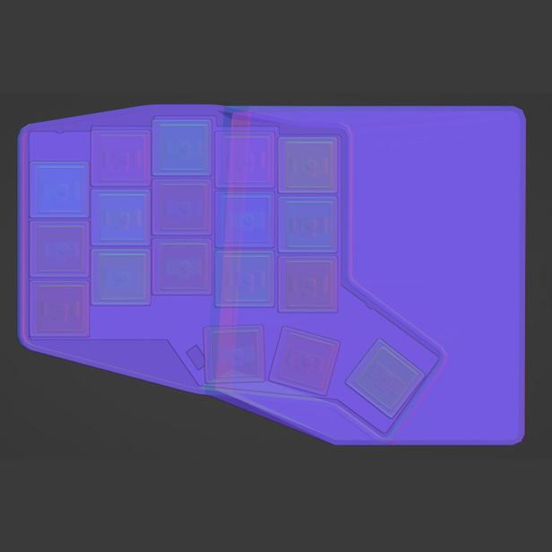
Then, we jumped again onto Blender to get a quick first overview then once it was good enough we printed it!


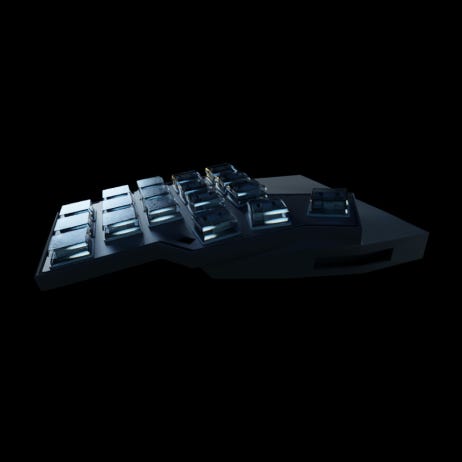
+ BONUS, here is a sneak peek of what LXR could look like with this design…
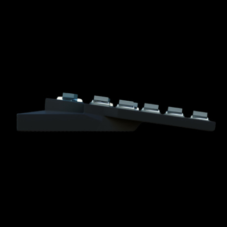
Printing the Shark
This time, we decided to print it by positioning the case on its side.
Just in case, the Bambu Lab X1 is still a great printer for what we do.
First contact with the Shark
Once finished and out of the oven, it was clear that this design was a leap forward in comparison with the Mammoth.
It still has printing defects due to its curves, but at that stage we don’t really care. For the moment, the focus is more on the functional than the visual.
What does it look like in the hands?
Let’s compare to the Mammoth


We’ll let you guess which is which?
Even if we have a lot of respect for our first-born, the differences between both cases are quite obvious.
The Shark offers a thinner and more elegant design.
Easier to transport, more comfortable & opens the door to simple component customization.
Lessons Learned
Where the Mammoth gave us an idea of the feasibility, the Shark offered to us a concrete sneak peek of what LXR could look like.
Optimisation opportunities:
We need to think of the case more as a modular base able to accommodate different hardware without compromising on the overall volume.
Material selection:
Stick to PLA for now but soon it will be time to move to higher quality materials
What's Next?
The path forward is now even clearer, we have now the conviction that we can make it sleek, yet modular..
Stay tuned for the next Devlog as we delve deeper into component selection and fine-tuning!
Until then, keep INNOvating!
Participants’ corner
This week, we’d like to ask your thoughts on the form factor of our case.
As LXR is designed to be modular yet compact & comfortable, at this stage, which form factor has your preference? Do you have any recommendation?
Don’t hesitate to share with us within the comments section!

